

What is gridstack.js?
gridstack.js is a TypeScript library for building dashboard layouts in the browser. Widgets sit on a column-based grid and can be dragged, resized and rearranged by the user, while the layout engine moves other widgets out of the way. The project is developed in the gridstack/gridstack.js repository, published on npm as gridstack and documented on gridstackjs.com, which hosts the demos and the generated API reference. The README describes it as a mobile-friendly, pure TypeScript library with no external dependencies, inspired by the no longer maintained gridster, and the npm package declares no runtime dependencies.
According to the README, gridstack.js was originally created by Pavel Reznikov, later maintained by Dylan Weiss and is currently maintained by Alain Dumesny. The GitHub repository dates from November 2014. Over its major versions the library shed its dependencies: lodash was removed in v0.5 and the jQuery API in v1, v2 was a TypeScript rewrite, v3 replaced jQuery UI with an HTML5 drag and drop implementation, and v6 moved to native mouse and touch events so that the same build works on desktop and mobile. Version 12 switched column and cell height handling to CSS variables, which removed the need for extra CSS per column count and dropped Internet Explorer support.
The library is installed with npm install --save gridstack or yarn add gridstack and used either as an ES module, importing GridStack and gridstack.min.css, or as the single gridstack-all.js file in a script tag. The same package ships framework wrappers under gridstack/dist/angular, gridstack/dist/react and gridstack/dist/vue. Version 13.0.0 of July 18, 2026 rebuilt the React wrapper on the pattern of the Angular one, added a new Vue 3 wrapper and renamed the Angular widget fields to component and props, so layouts saved as JSON use the same shape in all three frameworks.
The current release is v14.1.1, dated November 16, 2026 in the changelog and also the version tagged latest on npm. It makes the drop target follow the grabbed handle, lets a collapsed sub-grid act like a folder, and fixes React and Vue item content being unmounted by a change event during a drag. Version 14.1.0 of November 4, 2026 decides drags between grids by how much of the item overlaps a grid and starts auto-scrolling when the cursor nears an edge. Version 14.0.0 of September 20, 2026 replaced the float boolean with a mode option of top, float, list or compact, removed grid.float() in favour of grid.mode(), and added cellHeight: 'fill'.
gridstack.js is released under the MIT license and runs entirely inside the web application that includes it; the project operates no hosted service. It handles layout and interaction, while widget content is rendered by the application: since v11 the library no longer sets innerHTML itself, and a GridStack.renderCB callback or the framework wrappers create the content. Projects listed on iThub that address dashboards at the framework level include Refine, a headless React framework for admin panels and dashboards, and Toolpad, React components for admin panels.
Key capabilities
- Grid and widgets
GridStack.init()turns an element with thegrid-stackclass into a grid, and widgets are added withaddWidget(), loaded from a list ofx,y,w,hobjects, or picked up from existing DOM items withgs-attributes. The default grid has 12 columns, and thecolumnoption sets another count; since v12 no extra CSS file is needed for other column counts. - Drag and drop Widgets are dragged with native mouse and touch events, optionally only by a handle such as a title bar. Items can move between grids, be dragged in from a sidebar set up with
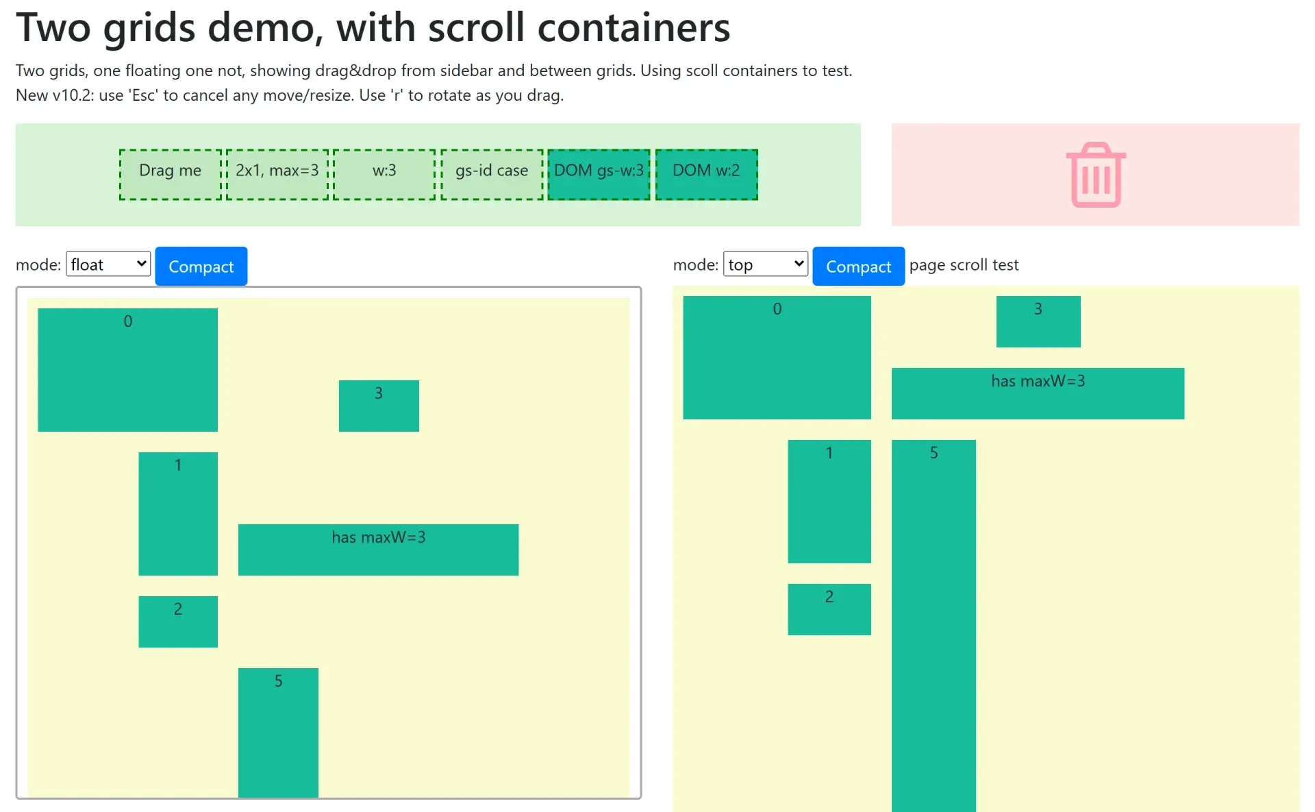
GridStack.setupDragIn(), or be dropped on a removal area. In the two grids demo, Esc cancels a move or resize and the r key rotates an item while dragging. - Resizing and locking The
resizableoption chooses which handles appear, for examplee,se,s,sw,w, andalwaysShowResizeHandledefaults to showing handles on mobile devices. Widgets accept minimum and maximum width and height, and items can be locked so others cannot push them, or have moving or resizing disabled. - Layout modes The
modeoption added in v14 selects how items settle:top(the default) moves items up,floatleaves them where they are dropped,listre-flows all items in row order like a re-orderable list, andcompactpacks them. Oldfloat: truesettings in code or saved JSON are migrated at runtime, but the TypeScript option is gone. - Responsive columns Since v10,
columnOptsdefines breakpoints as width and column pairs or computes the column count from a target column width. A one-column layout on small screens is configured explicitly, for example with a breakpoint of 768 pixels and 1 column. The demo site includes responsive examples by column size, by breakpoints and with layout set to none. - Nested grids Grids can be nested to any depth, with items dragged in and out of sub-grids since v5.
subGridOptsconfigures children,column: 'auto'keeps nested items the same size while the parent resizes, and v14.1.1 lets a collapsed sub-grid receive items like a folder. Events from nested grids are sent to the main grid since v12.1. - Save and load
save()returns the layout as JSON, including nested grids and, since v14, themodevalue, andload()restores it, so a layout can be stored per user and rebuilt later. The serialization and nested demos show saving, clearing, destroying and re-creating grids from the saved data. - Sizing options
sizeToContent, added in v9, grows or shrinks a widget to fit its content.cellHeightaccepts pixel and viewport units, andcellHeight: 'fill'from v14 divides the container height between the rows. Lazy loading of widget content is available since v11. - Angular wrapper The Angular wrapper provides a
<gridstack>component andGridstackItemComponent, usable as standalone imports or through a module. Dynamic widgets are registered withGridstackComponent.registerComponents()and described in JSON withcomponentandprops, and signal inputs are supported. A running example is linked from the wrapper's README on StackBlitz. - React wrapper The React wrapper is imported from
gridstack/dist/reactand renders a<GridStack>component from grid options plus an optional map of components for dynamic widget types. Its design keeps widget content alive when items are dragged between grids, and it supports events and lazy loading. - Vue 3 wrapper The official Vue 3 wrapper, imported from
gridstack/dist/vue, mirrors the React API with the Composition API,provideandinject, composables and<Teleport>for moving widgets without destroying them. Widgets are declared with the samecomponentandpropsfields as in Angular and React. - Other framework bindings The README lists community bindings outside the repository, such as ember-gridstack for Ember, aurelia-gridstack, gridstack-angular for AngularJS and a Rails gem, plus a Knockout.js demo on the website. These packages are maintained separately and some target older gridstack versions.
- Printing Since v13.1, grids print with widgets sized to their content and flowing across pages without being cut in half. Per-widget
PrintOptionsforce a page break, switch a page to landscape or portrait, hide a widget without leaving a gap, or let a tall widget such as a long table break across pages. - DOM order and accessibility Since v13.1 the DOM order follows the visual order when widgets are moved, which keeps keyboard tabbing and regular printing in sequence. Other fixes cover drag handles inside open shadow roots, iframes inside widgets during drags, and right-to-left layouts shown in a dedicated demo.
- Extension points The
GridStackprototype can be extended with custom methods, and since v5.1 a custom layout engine can subclassGridStackEngine, override methods such asmoveNode()and be registered globally withGridStack.registerEngine(). - Events and API Grids emit events such as
added,removed,change,dragstart,drag,dragstopand the resize equivalents, and sidebar drag-in items emit drag events since v14. Setter methods return the grid so calls can be chained. The full option and method list is in the API documentation for the latest release and indoc/API.mdon the master branch. - Content rendering and security Since v11 the library no longer assigns
innerHTMLfrom widget data, to avoid accidental cross-site scripting. Applications provide content throughGridStack.renderCBor the framework wrappers, and the README notes that real applications should sanitize HTML, for example with DOMPurify, before inserting it.
Where gridstack.js fits
User-customizable dashboards
An application renders its dashboard widgets into a grid, lets users move and resize them, and stores the result of grid.save() per user. On the next visit, grid.load() rebuilds the same layout from the JSON. The serialization demo shows saving a layout, clearing the grid and loading it back.
Widget palettes and removal
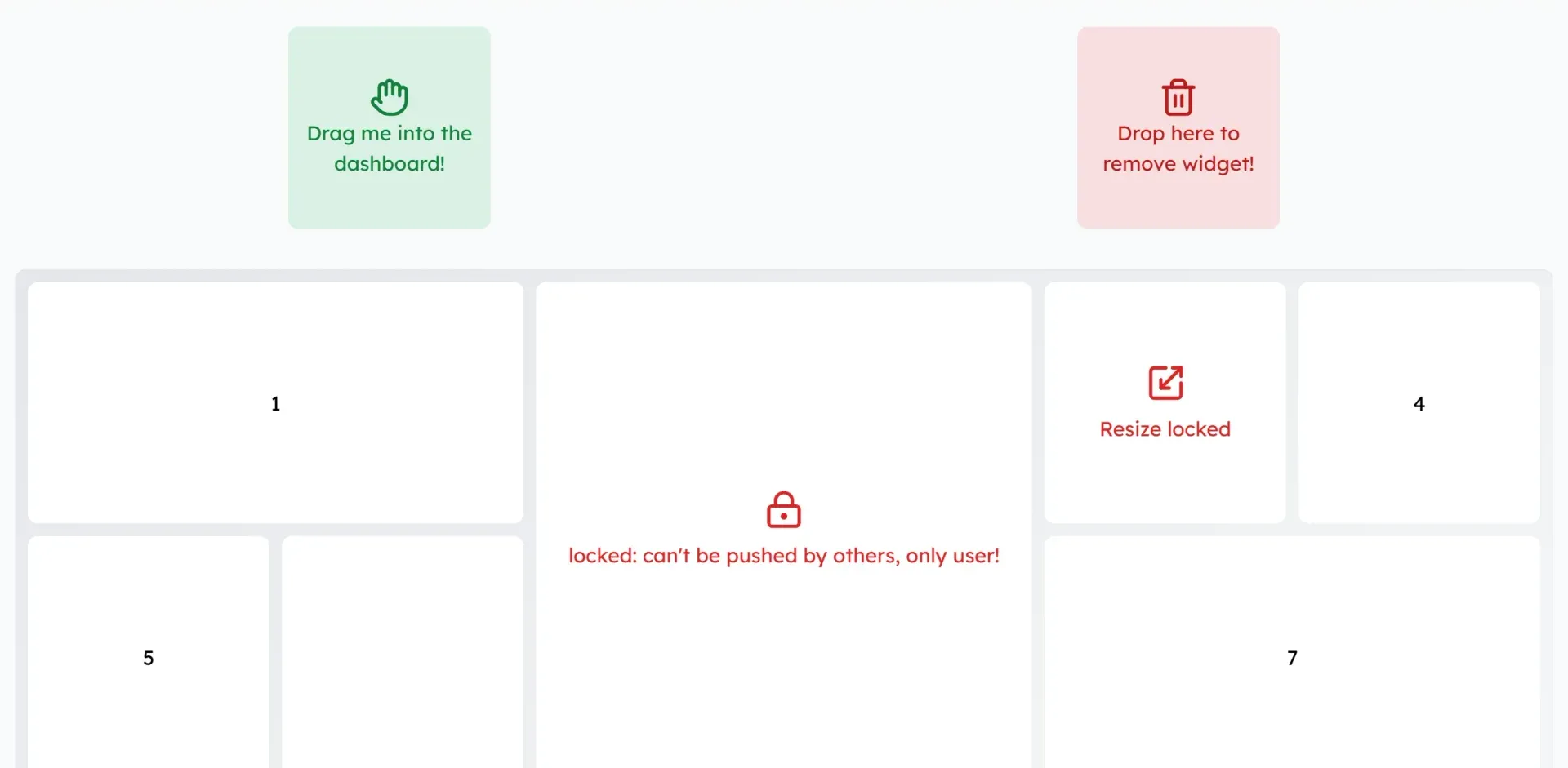
A toolbar or sidebar of widget types is connected with GridStack.setupDragIn(), with a GridStackWidget definition per item describing what to create on drop. A removal area deletes widgets dropped on it. The advanced demo on the gridstackjs.com home page combines a drag-in tile, a trash zone and locked widgets.
Layouts that adapt to screen width
columnOpts breakpoints reduce the number of columns as the grid narrows, for example to a single column below 768 pixels, and the layout option controls how widgets are rearranged when the column count changes. The breakpoint demo and the column-size demo show both approaches.
Grouped sections with nested grids
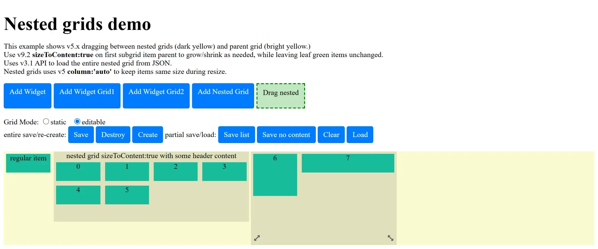
A widget can contain its own sub-grid, so dashboards can group widgets into sections that move as a unit while their children stay draggable. With sizeToContent the section grows with its contents, and items can be dragged between the parent grid and sections, as in the nested grids demo.
Re-orderable card lists
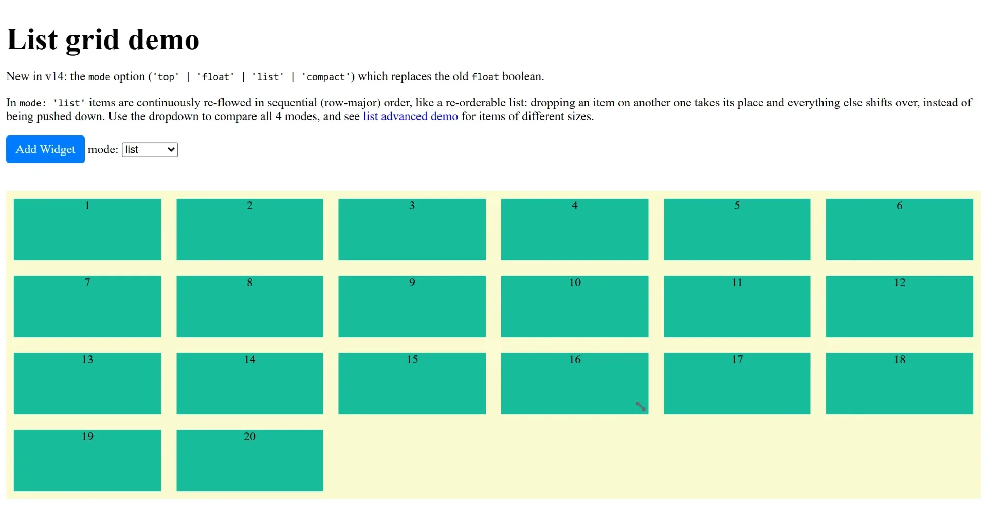
With mode: 'list', the grid behaves like a sortable list: dropping an item on another takes its place and the remaining items shift over in row order instead of being pushed down. The list demo compares all four modes, and an advanced variant covers items of different sizes.
Framework components as widgets
In Angular, React or Vue, widget types are registered as components and referenced from the layout JSON by component name with props. The wrappers create the components when widgets are added or loaded and keep them mounted when items move between grids, so the saved layout format stays the same across the three frameworks.
Install
npm install --save gridstackReviews of gridstack.js
Be the first to share your experience with gridstack.js.
Write a review
Loading review form…
Found gridstack.js useful? Upvote it todayYour vote helps other IT teams find it in the daily ranking.