

What is Astryx?
Astryx is an open source design system for React published by Meta under the MIT license. According to the project README, it grew inside Meta over eight years, became the most used and largest design system in the company and powers more than 13,000 apps. The public release is marked as Beta. Components are built on React 19 or later and their styles are authored with StyleX, although applications consume pre-built CSS and typed React components and do not need a build plugin, PostCSS or Babel configuration.
The system is distributed as npm packages under the @astryxdesign scope. @astryxdesign/core holds the components, theme system and utilities, @astryxdesign/cli provides component docs, templates, scaffolding, themes and codemods, @astryxdesign/build contains build plugins for StyleX source builds, and seven theme packages (neutral, butter, chocolate, matcha, stone, gothic and y2k) supply ready-made looks. @astryxdesign/richtext, a rich text field built on Lexical, became a stable package and has installed at the same version as Core since v0.7.1. The README states that @astryxdesign/lab is internal and unpublished, and that the chart packages @astryxdesign/vega and @astryxdesign/charts exist only under the npm @canary dist-tag.
The README describes 150+ components and the official website lists more than 180, together with foundations (typography, color, layout, accessibility), page templates and patterns such as table pages, detail layouts, form wizards and navigation. The project calls itself "agent ready": the API, documentation and CLI are designed so that people and AI coding assistants use the same reference. In practice this consists of the CLI with a typed JSON output mode, generated agent instructions for files such as AGENTS.md and CLAUDE.md, a hosted MCP server, an agent skill for global installs and an llms.txt file on the documentation site.
The latest GitHub release is v0.7.13, published on November 10, 2026; every @astryxdesign/* package ships at that version. Its notes list Tokenizer and Typeahead keyboard changes, a shared screen reader live region for swizzled and package components, a BottomSheet touch fix for iOS Safari, removal of data: URLs in the Markdown parser, and an experimental icon set ordering feature in the CLI. The v0.7.0 announcement summarized earlier work on forms, mobile layouts, menus, Markdown and tables.
The repository is a pnpm monorepo containing example apps, the documentation site and Storybook in apps/, the published packages in packages/ and internal tooling in internal/. Contributors need Node 22 or later and pnpm 11. Documentation lives at astryx.atmeta.com, with a live Storybook, a sandbox, a changelog and a Discord server for questions.
Astryx screenshots
Explore the interface. Open a screenshot to view it at full size.
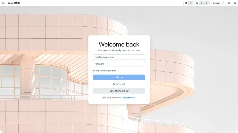
Login (SSO) page template shown in the Astryx preview frame, from the official website.
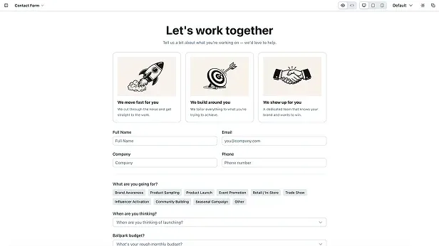
Contact Form page template from the Astryx templates collection, from the official website.
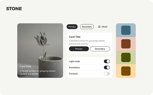
Components rendered with the Stone theme, from the official website.
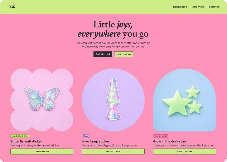
Storefront page rendered with the Y2K theme, from the official website.
Source: official Astryx project page.
Key capabilities
- React component library The core package exports the components as typed React components, imported per entry point such as
@astryxdesign/core/Buttonto keep bundles small. The README counts 150+ components and the website more than 180.reactandreact-dom19.0.0 or later are peer dependencies, and@stylexjs/stylexis installed alongside Core. - Pre-built CSS with cascade layers Applications import
reset.css,astryx.cssand a theme stylesheet. The files load into thereset,astryx-baseandastryx-themecascade layers, so the documented import order matters. The getting started guide notes that unlayered styles and later layers overrideastryx-baseregardless of specificity. - Seven theme packages Neutral, butter, chocolate, matcha, stone, gothic and y2k ship as
@astryxdesign/theme-*packages. Gothic is a dark-only theme, and neutral is described as the muted starting point. The CLI commandtheme listshows them andtheme addgenerates anastryx-themesmodule with the built theme, production CSS and optional font CSS. - Themes as CSS custom properties A theme is a set of CSS custom property overrides, so branding does not require forking or wrapping component source. Custom themes extend an existing one with
defineTheme({extends: ...})and are then built withastryx theme build. The theming documentation describestheme ejectfor an independent source fork that no longer receives package updates. - Light and dark mode Theme colors compile to CSS
light-dark()values that follow the color scheme. The website lists dark mode among the built-in features of the components. In browsers older than the documented support tiers,light-dark()is unavailable and theme colors may fall back to defaults. - Styling with your own tools StyleX is used internally but is invisible to consumers. Components accept
classNameoverrides from Tailwind, CSS modules or plain CSS, and anxstyleprop for StyleX styles created withstylex.create(). Atailwind-theme.cssbridge maps Astryx tokens to Tailwind utilities such asbg-surface,text-primaryandrounded-lg. - Swizzle for source ownership
astryx swizzle <Component>copies a component's full source into the project so a team can own and modify it. The command refuses to run outside a project. The v0.7.13 release made swizzled components share the package's live regions and layer runtime, so dialogs, Escape handling and screen reader announcements stay consistent. - Page and block templates The CLI lists and scaffolds templates with
astryx template --listandastryx template <name> <path>. The templates gallery includes dashboards, tables, forms, settings, login, AI chat, galleries, checkout wizards and app shells. Templates are content-only and composeLayoutslots; global navigation comes from components such asAppShell,TopNavandSideNav. - CLI with a JSON API
@astryxdesign/cliprovidessearch,component,hook,docs,template,theme,build,init,upgrade,doctor,discoverandgap-reportcommands. Every command except bare groups supports--jsonwith a typed envelope, andastryx manifest --jsonreturns a self-describing list of commands, options and response types. The README warns to use the scoped name, because the unscopedastryxpackage on npm is unrelated. - Generated agent docs
npx @astryxdesign/cli initwrites the Astryx component index, rules and CLI reference intoAGENTS.md, and also intoCLAUDE.mdwhen the project uses one. Options target Claude, Cursor, Codex, Hermes and Muse files, and a Cursor project rule path.upgradereports and refreshes a stale block after a dependency bump. - Hosted MCP server The Working with AI guide documents a remote HTTP Model Context Protocol server at
https://astryx.atmeta.com/mcp. It exposes two tools:search(query)for components, doc topics and templates, andget(name)for full documentation with props, usage and examples. The guide gives configuration snippets for Claude Code, Cline, Cursor and Claude Desktop. - Global install and agent skill
npm i -g @astryxdesign/climakes theastryxcommand available in any folder, while a project still runs its own installed version. The global install keeps one Astryx skill at~/.agents/skills/astryx/SKILL.md, linked into folders that agent tools read, such as~/.claude/skills/astryx. The CLI reports newer versions but never upgrades itself or a project. - Codemod upgrades
astryx upgrade --from <old version> --applyruns codemods that migrate code between releases. Release notes for v0.7.13 show the documented pattern: install every@astryxdesign/*package at the same version, then run the upgrade command with the previous Core version. - Doctor checks and CI gate
astryx doctorruns read-only checks for the Node.js version, Core installation, version alignment, theme packages, config file, agent docs, peer dependencies and package manager. It exits with code 1 when a check fails, which the CLI README presents as a CI step, and--jsonreturns a structured result. - Accessibility and internationalization The README describes the components as accessible, and release notes document screen reader announcements, focus return and keyboard behavior. An
InternationalizationProvidersupports alternative calendars such as Japanese and Buddhist while values stay Gregorian ISO dates. CLI component and docs reads are available in Simplified Chinese with--zh. - Browser support tiers The browser support page defines Tier 1 as Chrome and Edge 125+, Safari 26+ and Firefox 147+, with full CSS anchor positioning. Tier 2 (Chrome and Edge 114+, Safari 17+, Firefox 125+) is also officially supported, but tooltips, menus and popovers may not sit next to their trigger. Older browsers are best effort only.
- RichText field
@astryxdesign/richtextadds a labelled rich text form field built on Lexical, styled by the Astryx theme. It stores Lexical editor state as JSON, converts to and from Markdown without mounting an editor, and declares Lexical 0.52 as a peer dependency. Its toolbar works from the keyboard and the editor is announced to screen readers as a multi-line text box. - CDN usage without a bundler For prototypes and embeds,
npx @astryxdesign/cli template --cdnwrites an HTML page that loads Core and a theme from public CDNs through an import map with React 19 from esm.sh. The documentation asks for pinned versions, adata-astryx-themeattribute on<html>and an explicit body font.
Where Astryx fits
Adding Astryx to a Next.js app
The core README describes the simplest setup for Next.js: install @astryxdesign/core, @astryxdesign/theme-neutral and @stylexjs/stylex, import the reset, component and theme stylesheets in globals.css, and wrap the app in a client-side provider that renders Theme and LinkProvider with Next.js Link. Vite uses the same CSS imports and providers. The repository includes example apps for Next.js, Next.js with StyleX, Next.js with Tailwind and Vite with Tailwind under apps/.
Using Astryx alongside Tailwind CSS
Projects that already use Tailwind CSS declare an explicit @layer order, import Tailwind's theme and preflight into layers, then the Astryx stylesheets and the tailwind-theme.css bridge. The bridge maps Astryx tokens for text, surfaces, borders, status colors, radius and shadow to Tailwind classes, and Tailwind spacing follows the Astryx spacing unit, so p-4 equals 16px. The documentation notes that a @layer line placed below the Tailwind import inverts the cascade.
Building UI with an AI coding agent
The Working with AI guide has the agent install the CLI and run npx @astryxdesign/cli init --features agents. The generated instructions describe a three-step workflow: astryx build "<idea>" to choose a starting template, astryx template <name> <path> to scaffold it, and astryx component <Name> to read props before use. They also contain rules such as starting every page from a template, avoiding raw div elements and inline styles, and using tokens instead of hard-coded values. Agents that support MCP can query the hosted server instead of the CLI.
Branding an app with a custom theme
The documented flow installs the closest theme package, adds it with theme add, and customizes it with defineTheme extending the imported theme, then builds and adds the local theme. Several themes can be added and switched at runtime by passing a different entry of the generated themes object to Theme. The themes page previews each package, and the CLI guide docs author-a-theme covers authoring.
Keeping a project current
The getting started guide upgrades all Astryx packages to the same release in one install command and then runs npx @astryxdesign/cli upgrade --from <old Core version> --apply. Each theme names the exact Core release it works with. For pnpm projects that hold new releases back, the guide describes exempting the whole @astryxdesign/* scope so packages from different releases are not installed side by side. astryx doctor then reports version alignment, theme wiring and agent docs status.
Prototyping without a build step
For a prototype, astryx template --cdn writes a single HTML file pinned to the installed version, loading React 19 and Core from esm.sh through an import map. Components are created with React.createElement because nothing compiles JSX. The public playground and sandbox offer another way to try templates in the browser. Similar projects listed on iThub include Toolpad, a set of React components for admin panels.
Install
npm install @astryxdesign/core @astryxdesign/theme-neutral @stylexjs/stylexReviews of Astryx
Be the first to share your experience with Astryx.
Write a review
Loading review form…
Alternatives to Astryx
 ToolpadToolpad is MUI's MIT-licensed set of React components for dashboards and internal tools; the repository says it is no longer actively maintained.
 TailwindCSSTailwind CSS is a free, open-source utility-first CSS framework for building custom designs directly in markup; Tailwind Labs joined Shopify in September 2026 while the framework stays MIT-licensed.
 Next.jsNext.js is an open-source React framework maintained by Vercel for full-stack web applications. It adds file-based routing, Server Components, caching, image and font optimization, and deploys as a Node.js server, Docker image or static export.